Giants of Land
and Sea
Exhibit Design
2016-2018
Team:
Creative Director
Exhibit Designer
Content Developer
Brand Designer
Project Manager
My role:
I was the lead brand designer and led the development of branding, marketing, interactive visuals, and final production oversight.
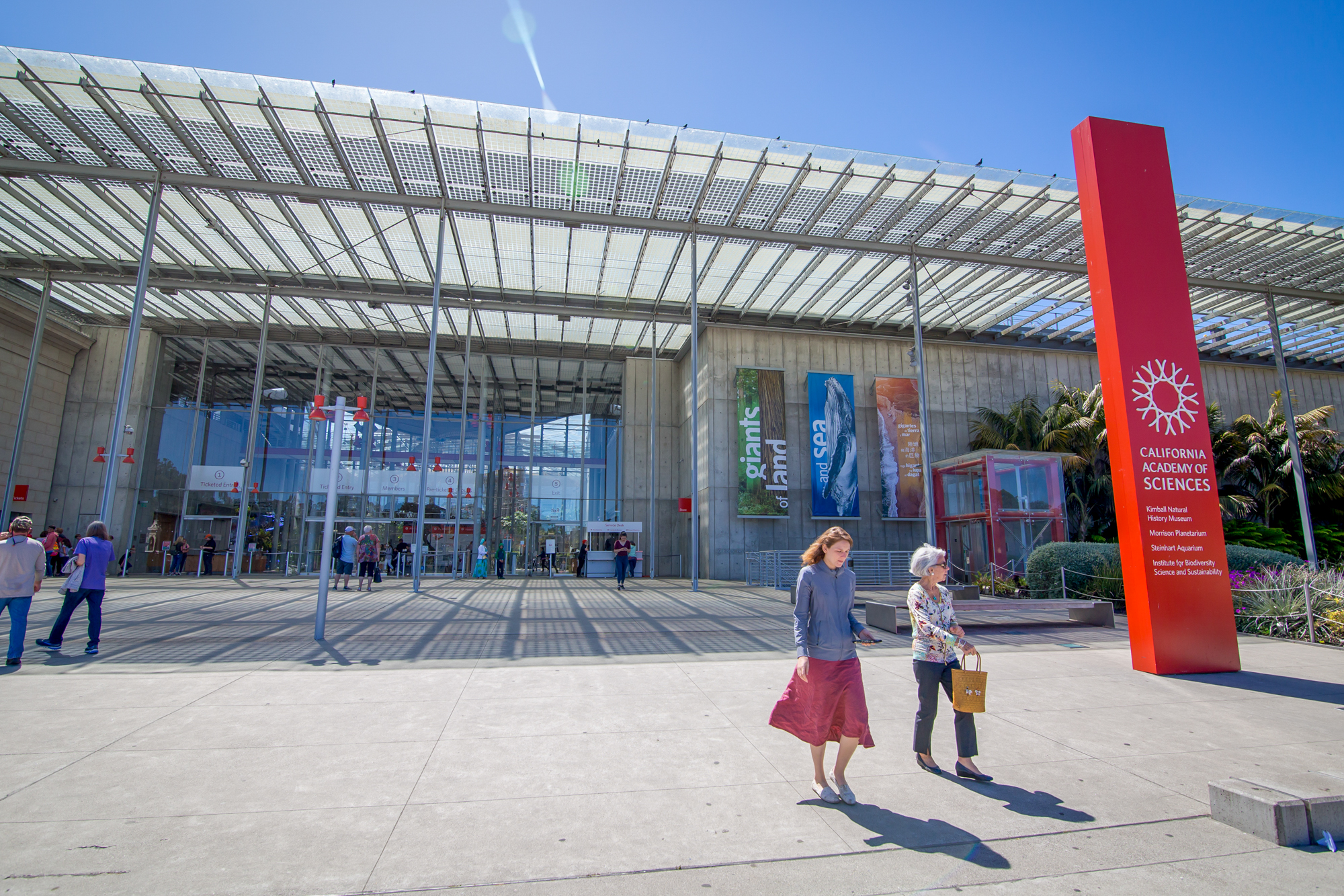
Giants of Land and Sea is an exhibit at the California Academy of Sciences that focuses on the unique ecosystems of Northern California, this exhibit focused on 3 main topics; sea life, redwood forests, and plate tectonics. I was the lead designer and developed the graphic identity, wordmark, digital and interactive guidelines, as well various 3d elements. I worked within a multidisciplinary team of content developers, educational specialists, 3d designers, local indigenous populations, and scientists.

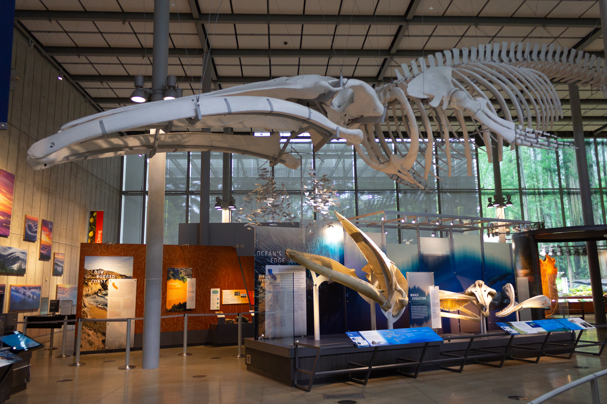
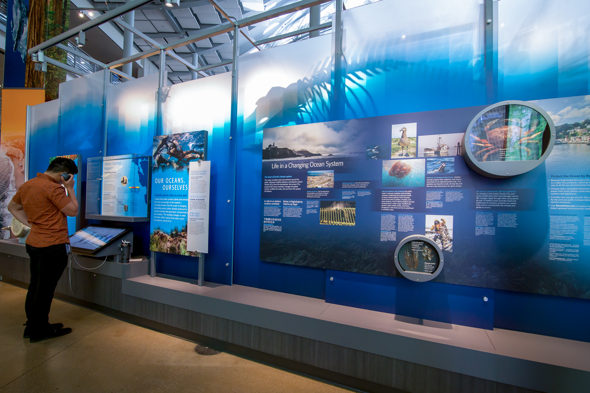
The back side of the skeleton articulation displays covers our impacts as humans on the ocean and environment.
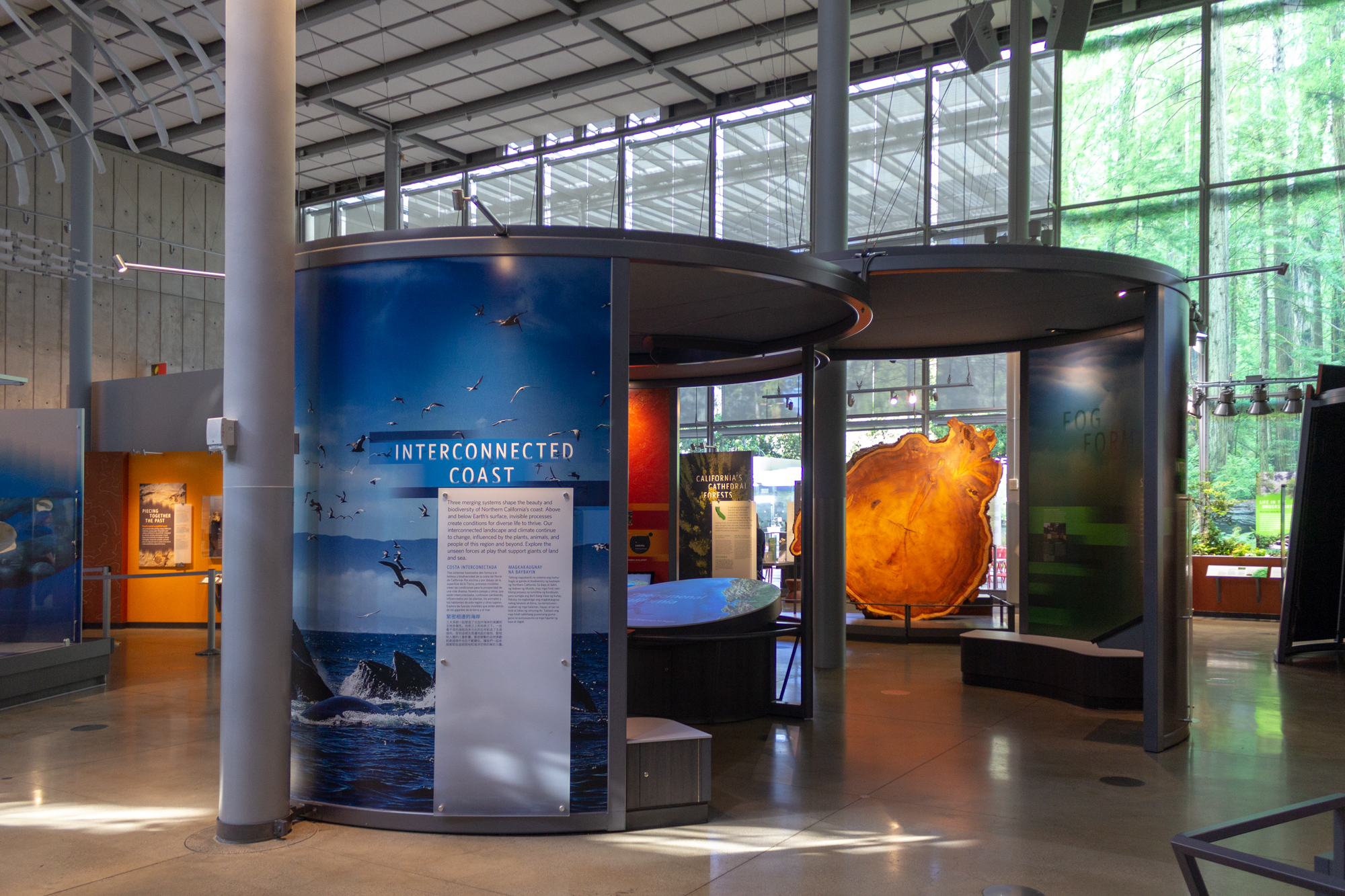
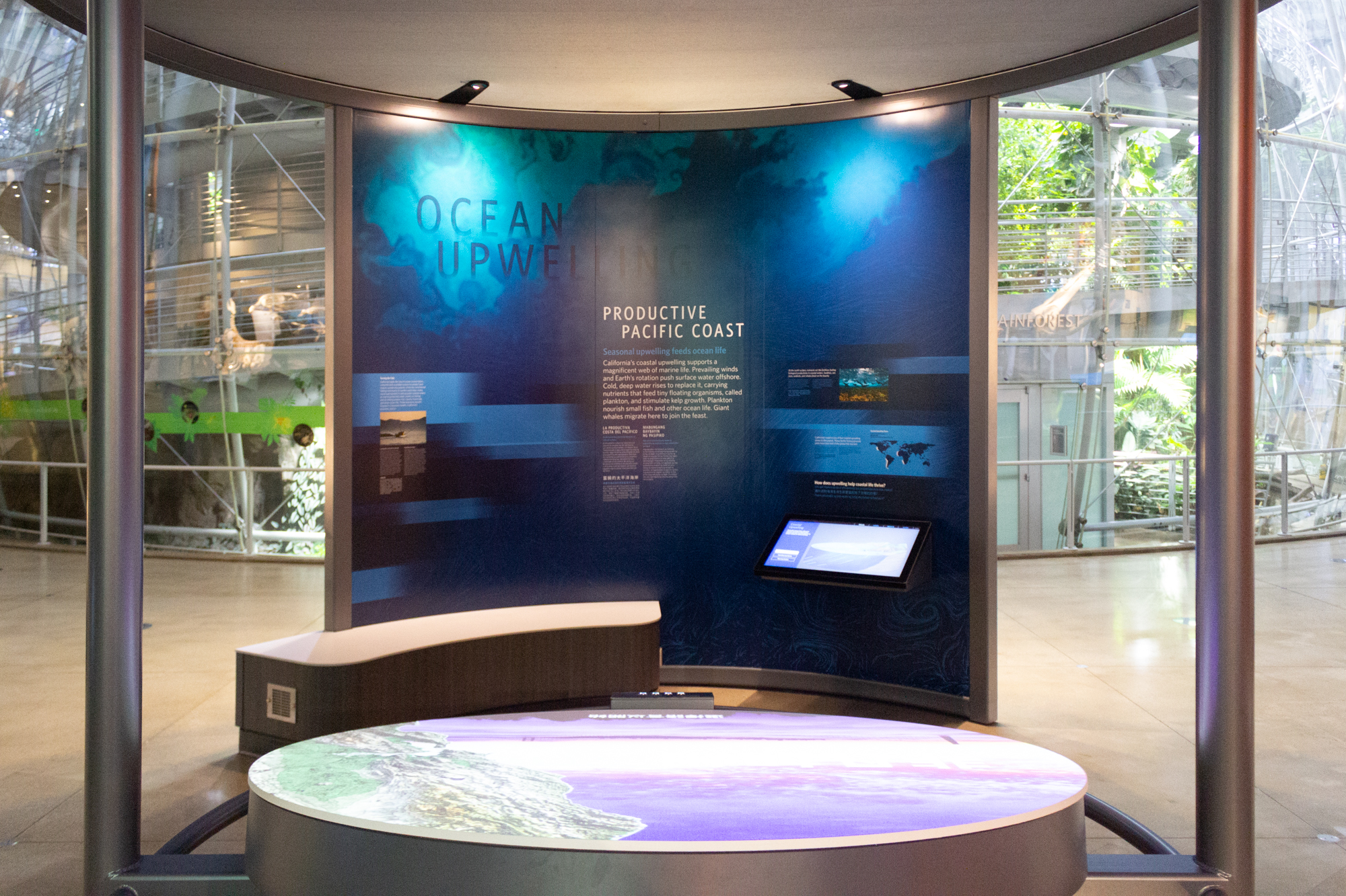
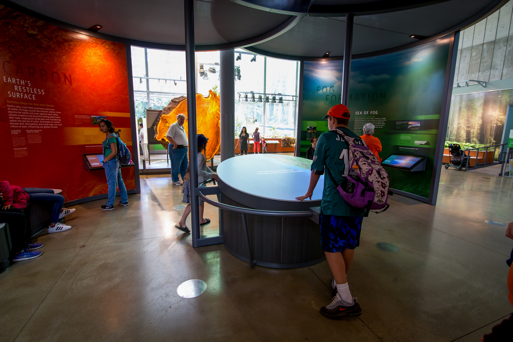
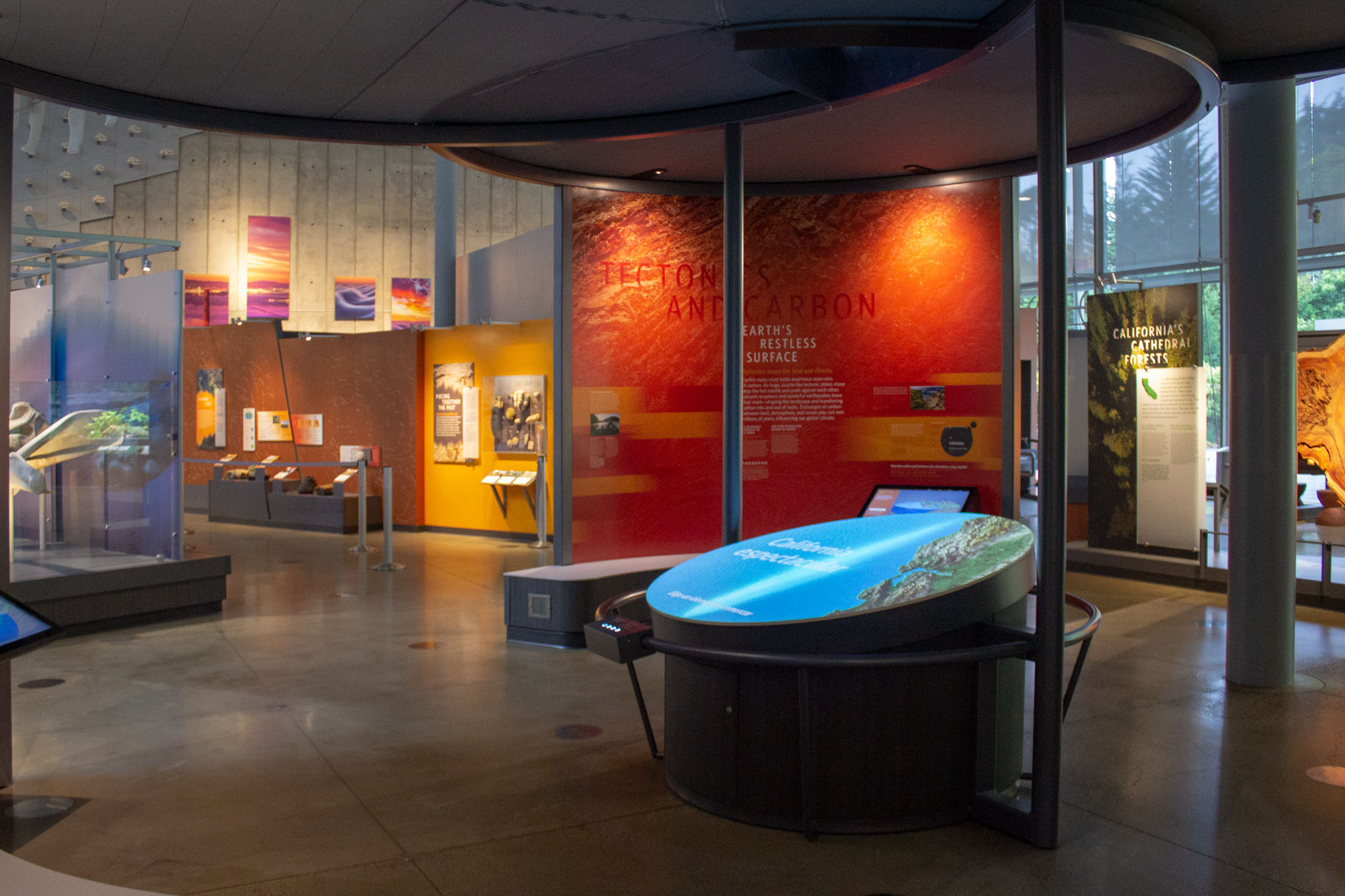
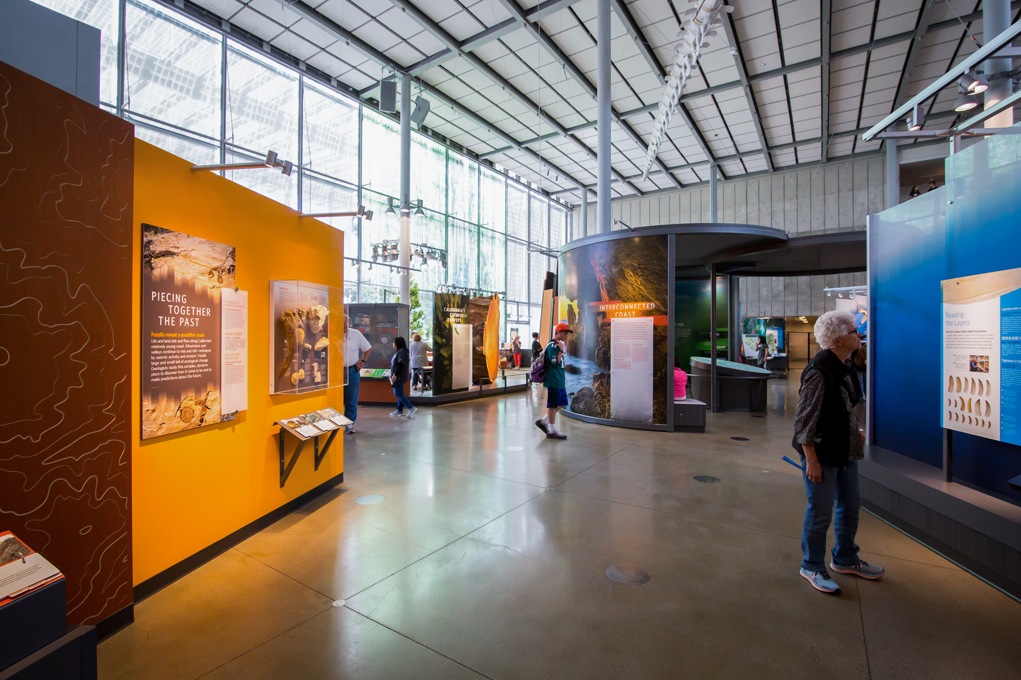
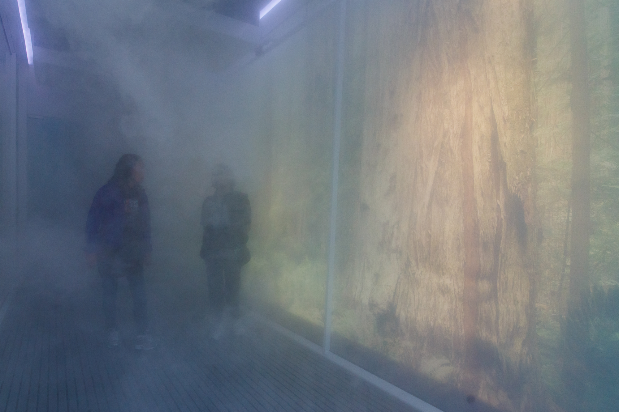
The center of the exhibit ties all the specimens throughout the exhibit into a story of how the beaultiful California coast was created. Only through millions of years of tectonic movement, ocean currents, and the physics of fog are all the incredible creatures and environments able to exist in one place.
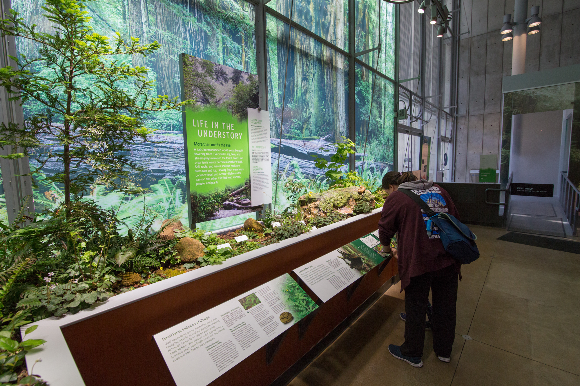
Under a giant 30 foot tall and 90 foot wide scale image of a redwood forest are planters filled with native species. There are ferns, sorrels, models of newts and slugs, and even a living and growing redwood sapling. This area is dedicated to the small creatures that live in redwood forests and make the dense life possible.
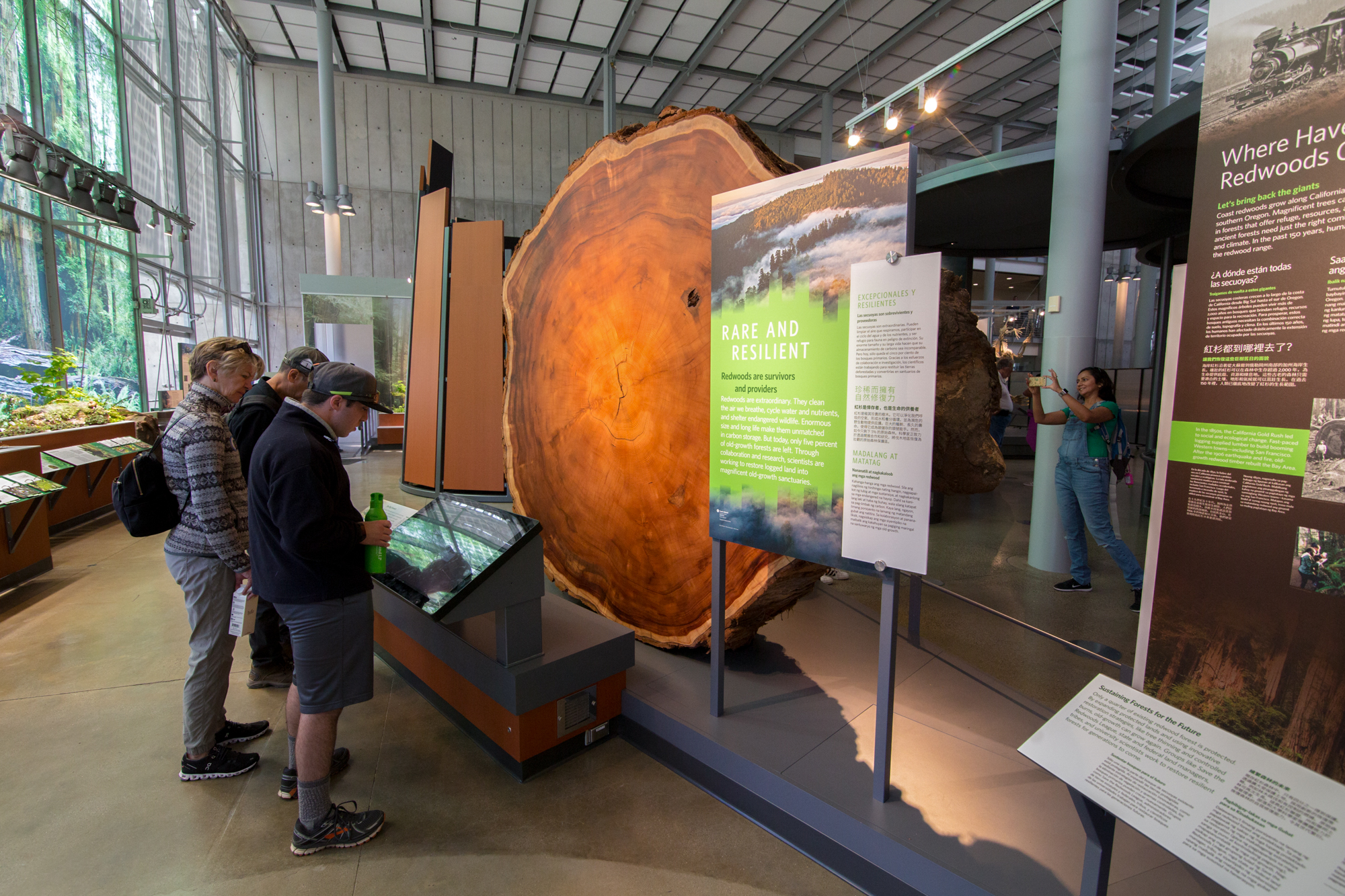
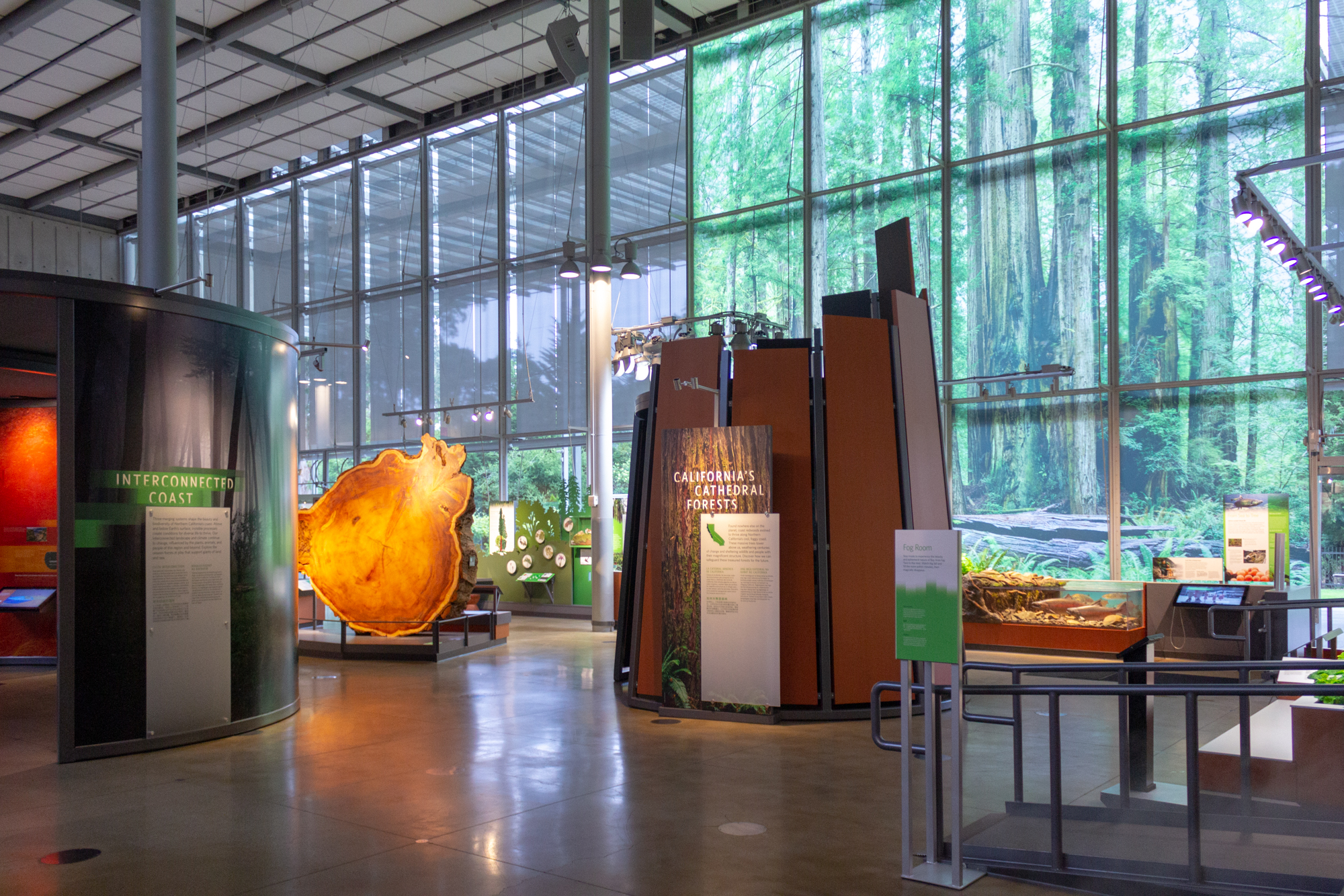
Flanking a 1300 year old redwood round are graphics that help interpret how much scientists can learn about Northern California's past through a single tree. There are large graphics that also explain what humans have done to devastate these massive trees in the past, and efforts we are making to restore them to their former glory.
Design System
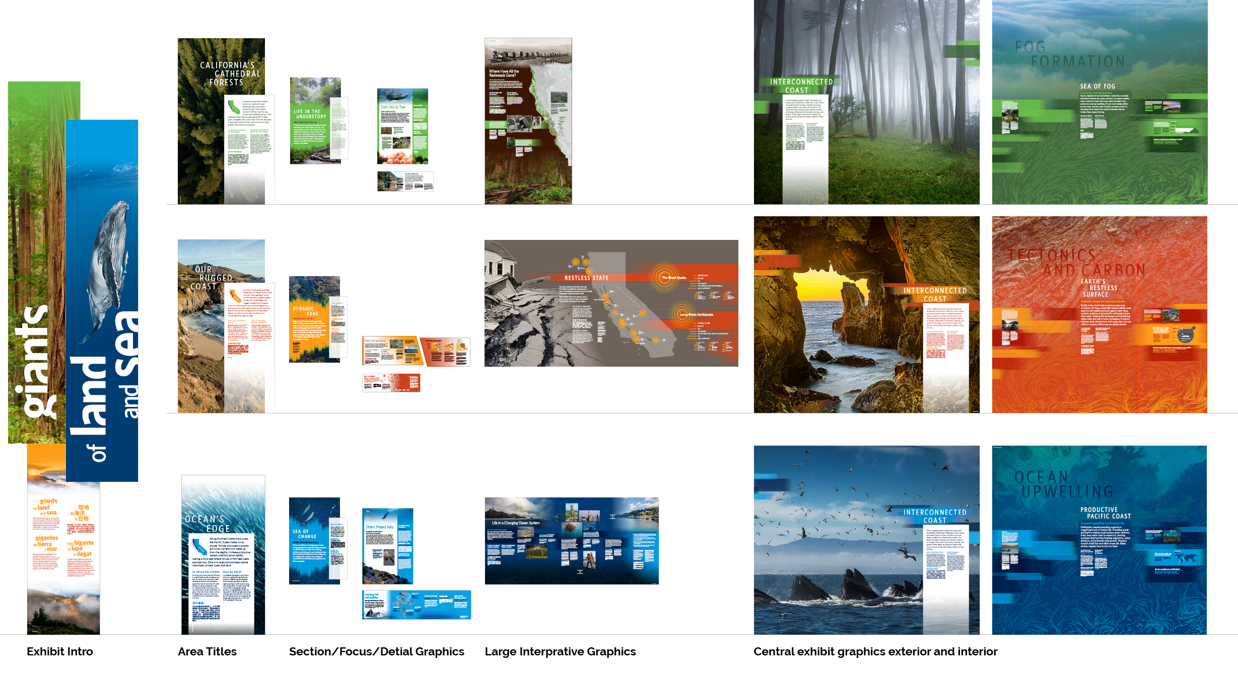
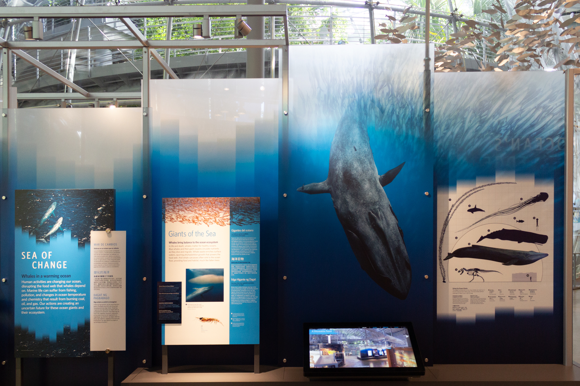
Three colors were used to help divide the exhibit into the three distinct topics, only merging in the center of the exhibit when all the topics come together. Condensed typefaces were used in the header to accentuate scale. The color gradients were inspired by the iconic fog of the California Coast.
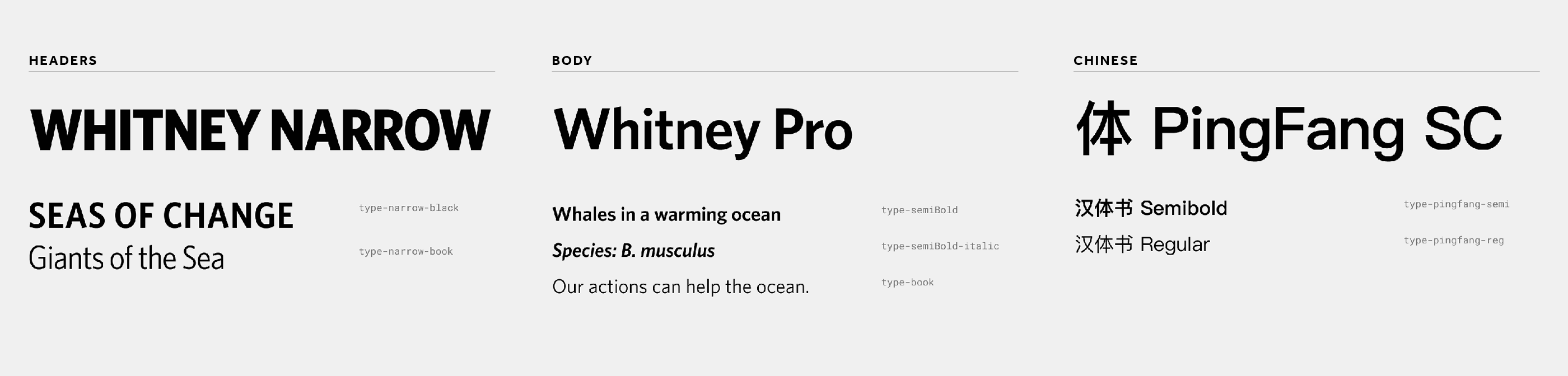
The typeface fmaily consisted of Whitney, the Academy's brand font, and PingFang SC for the Chinese translations.
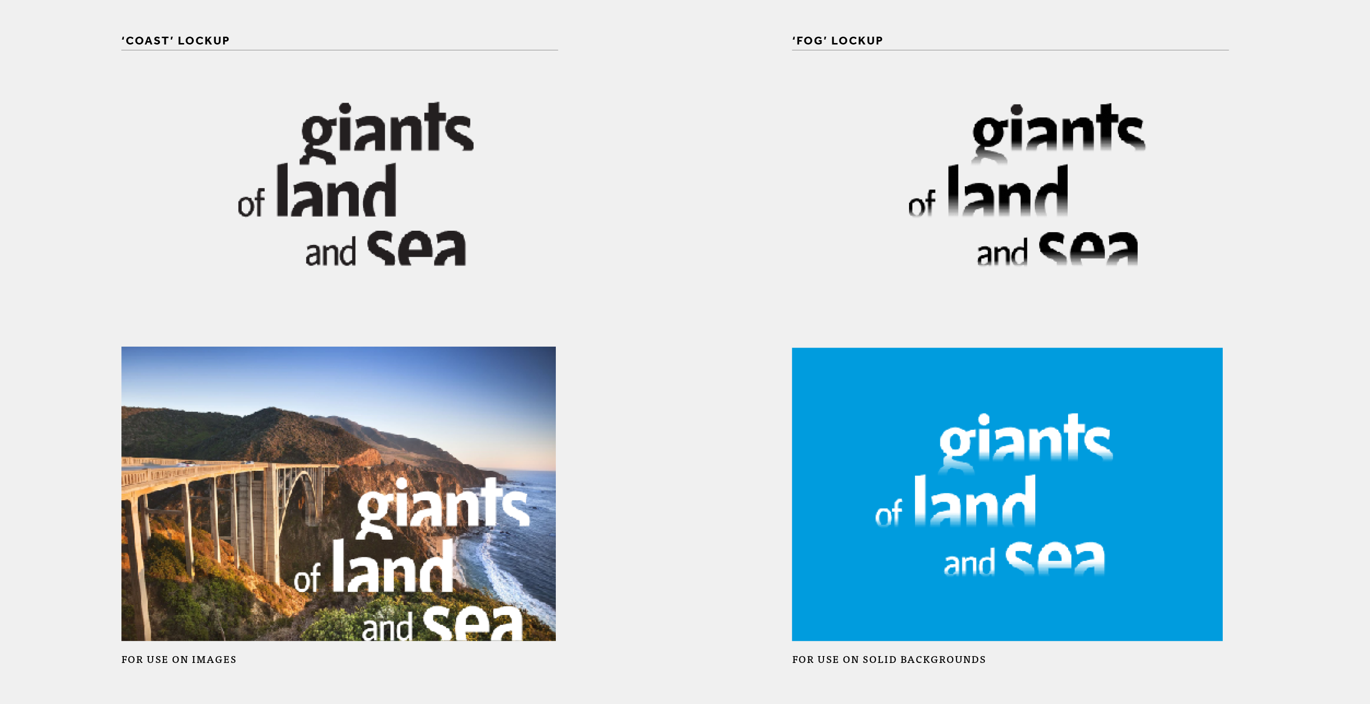
TThe wordmark was inspired by the three aspects of the exhibit’s content. Giant redwoods, geologic plate tectonics, and the iconic California coast. It was a challenge because of the title length and the known marketing and branding applications. The type is broken into three lines that highlight each exhibit section and have a horizontal crop at the bottom of the letter forms reminiscent of the dynamic Northern California coast line. Two versions of the wordmark existed depending on the needed interaction with the background. One represented the coast and the other represented fog.
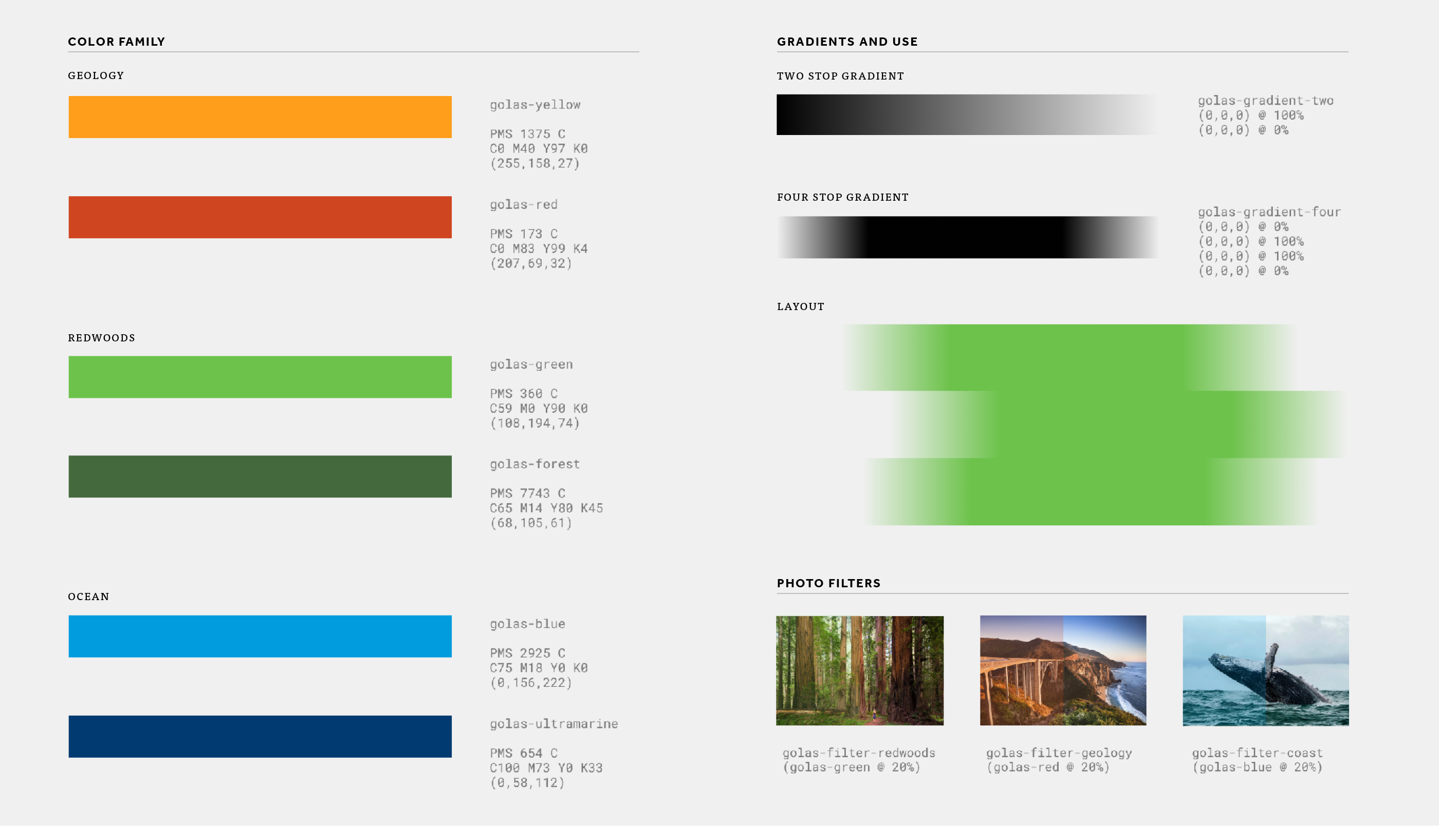
The color family aligned and organized the three content section with specific gradient and image treatments.